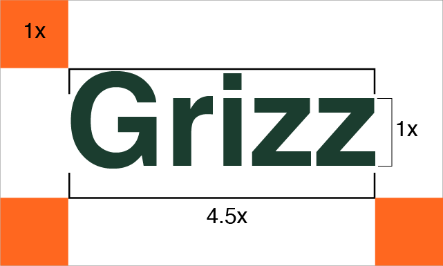
Brand Identity + Art Direction · 2024

GRIZZ
Outdoor

Project

GRIZZ Outdoor Identity

Scope

Brand Identity, Art Direction, Logo System

Timeline

Research to Delivery

Year

2024

Scroll to explore
GRIZZ BRAND IDENTITY OUTDOOR GEAR LOGO SYSTEM AUDIENCE TESTING COLOR STRATEGY GRIZZ BRAND IDENTITY OUTDOOR GEAR LOGO SYSTEM AUDIENCE TESTING COLOR STRATEGY

01 — Overview

Building a rugged identity system for GRIZZ outdoor gear.

0

% Brand Recall

0

% Social Save Rate

0

% Landing CTR Estimate

GRIZZ needed a distinctive brand language that feels durable and premium across apparel, packaging, and digital touchpoints.

The challenge was balancing rugged authenticity with premium clarity, without leaning on overused mountain-brand cliches.

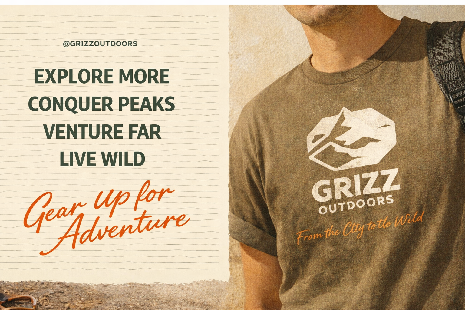
The final identity system stretched across product, retail, and campaign surfaces while staying legible, grounded, and memorable.

GRIZZ product lineup with outdoor jackets, packs, and brand labels

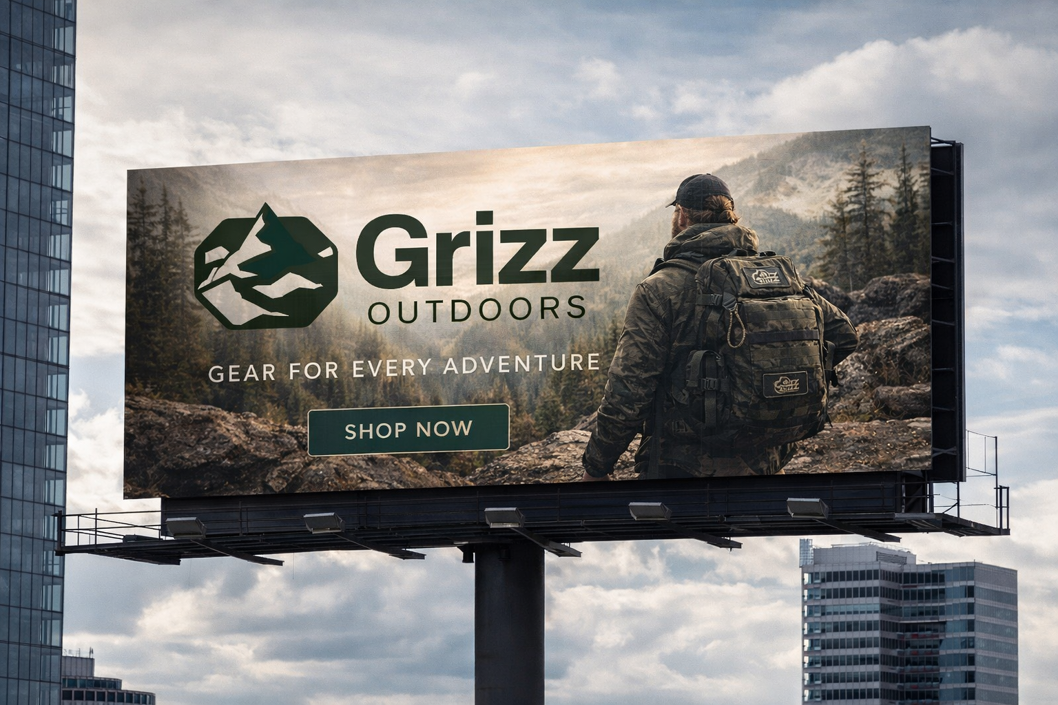
→ Identity applied across technical outerwear, packs, and launch visuals

02 — Process

01

Product Definition

Clarify how the identity should live across trail shells, camp gear, utility apparel, and retail assets.

Touchpoints Retail Assets Applications

02

Problem Framing

Find a path between rugged authenticity and premium clarity without defaulting to category cliches.

Tone Differentiation Hierarchy

03

Logo System

Build primary, wordmark, and secondary marks with clear spacing and scalable rules.

Primary Mark Wordmark Secondary Logo

04

User Testing

Test legibility, tone match, and purchase intent with hikers, climbers, and lifestyle buyers.

Legibility Tone Match Iteration

05

Palette Rationale

Select durable neutrals and ember accents that work on gear, labels, and screens.

Color Logic Contrast Recognition
"
The system feels premium in the city and believable in the wild, which was exactly the balance we needed. — GRIZZ Brand Review

03 — What Was Built

Identity Architecture

A complete visual system spanning logo lockups, typography tone, and category-specific applications.

Product Touchpoints

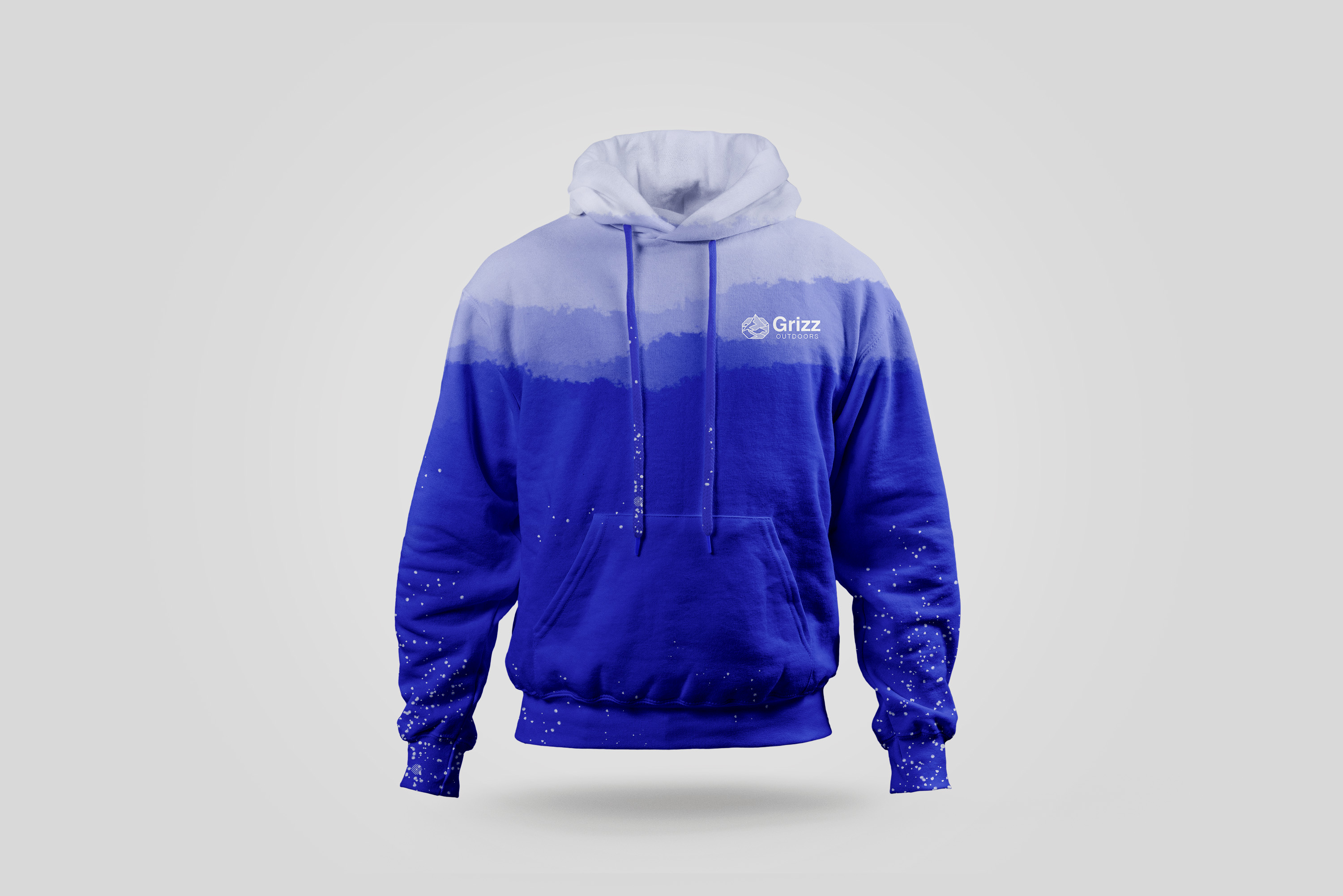
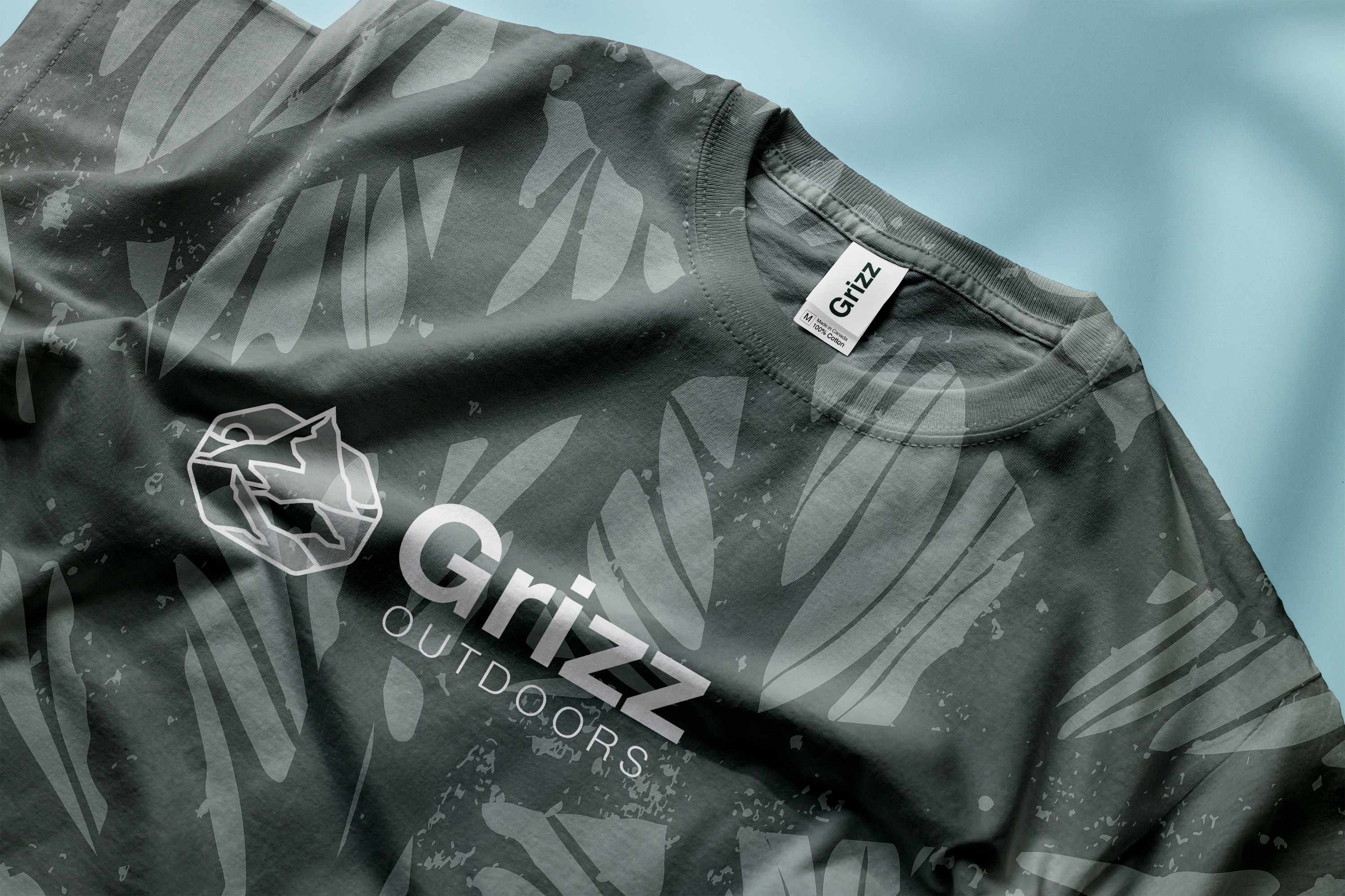
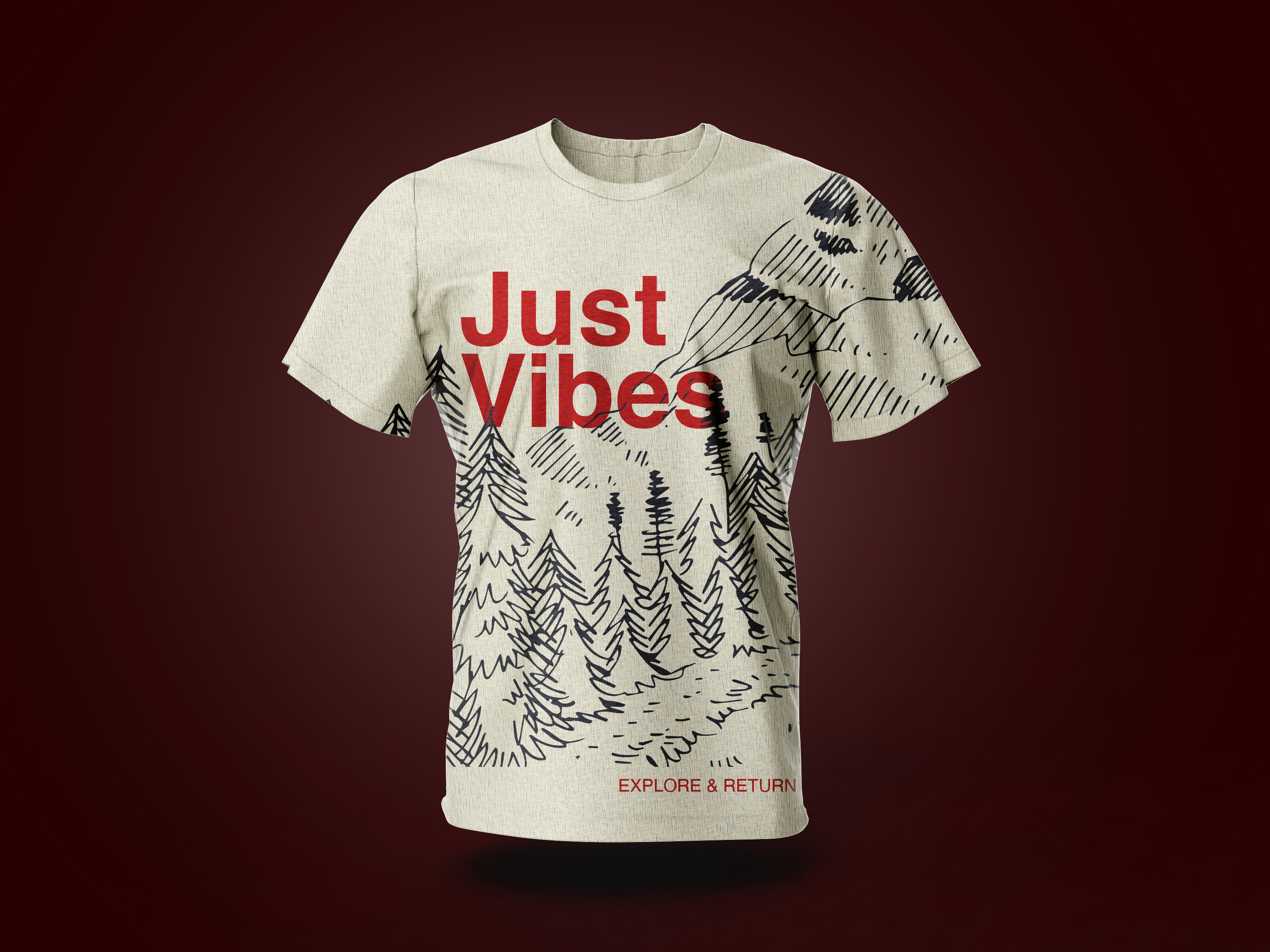
The brand was designed to feel coherent across shells, packs, apparel, posters, and packaging.

Audience Strategy

Urban professionals who recharge outdoors shaped the tone, legibility, and utility of the system.

Testing & Refinement

Preference testing surfaced clarity issues early and informed type, spacing, and contrast adjustments.

Logo Rules

Primary, wordmark, and secondary marks were documented with spacing, scaling, and usage guidance.

Palette Selection

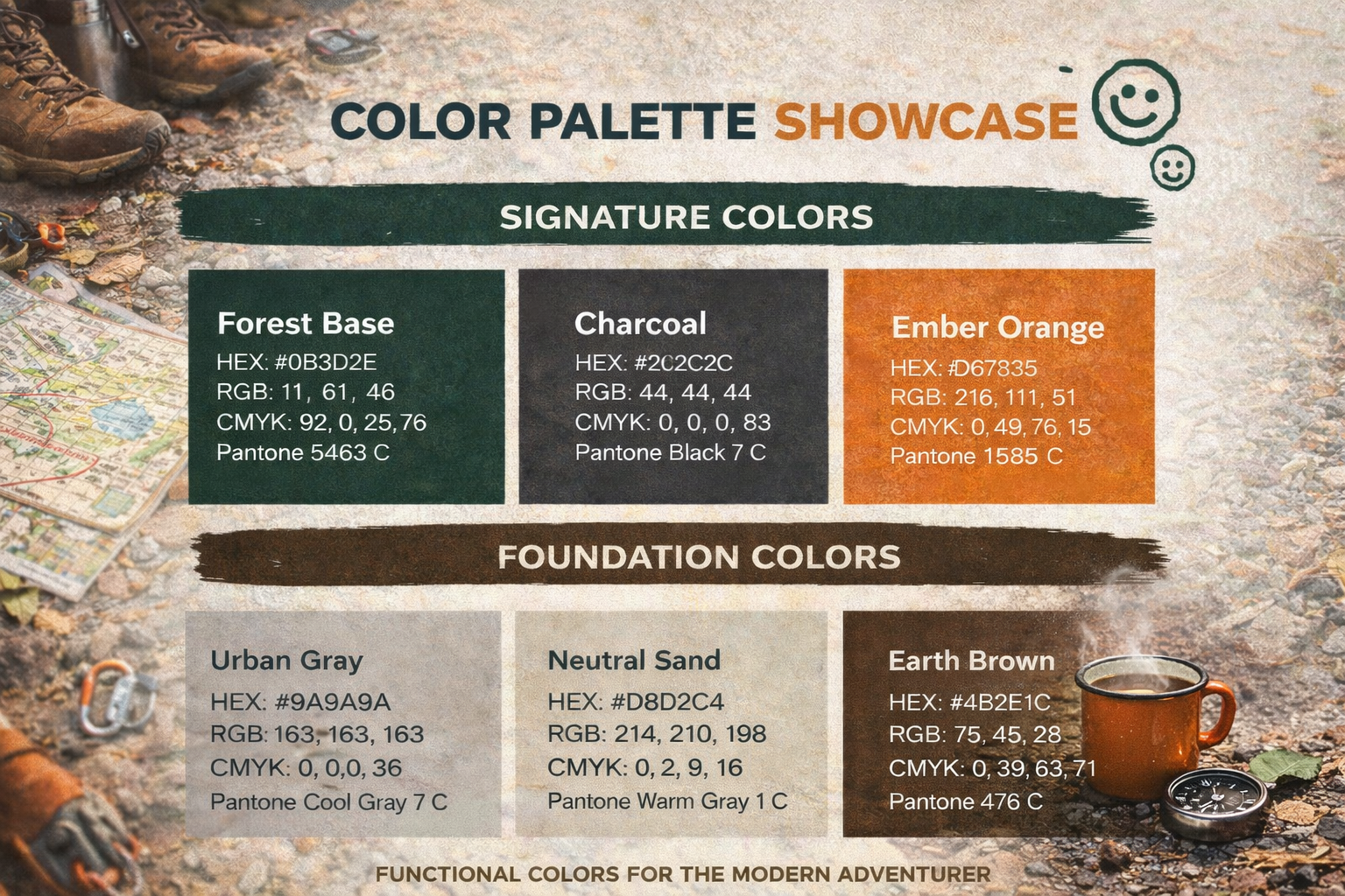
Deep green, charcoal, ember, and grounded neutrals balanced rugged trust with premium finish.

— Visual Showcase

I split the brand applications into product-focused groups so the apparel system, hang tag details, and supporting campaign visuals each get their own rhythm instead of competing inside one strip.

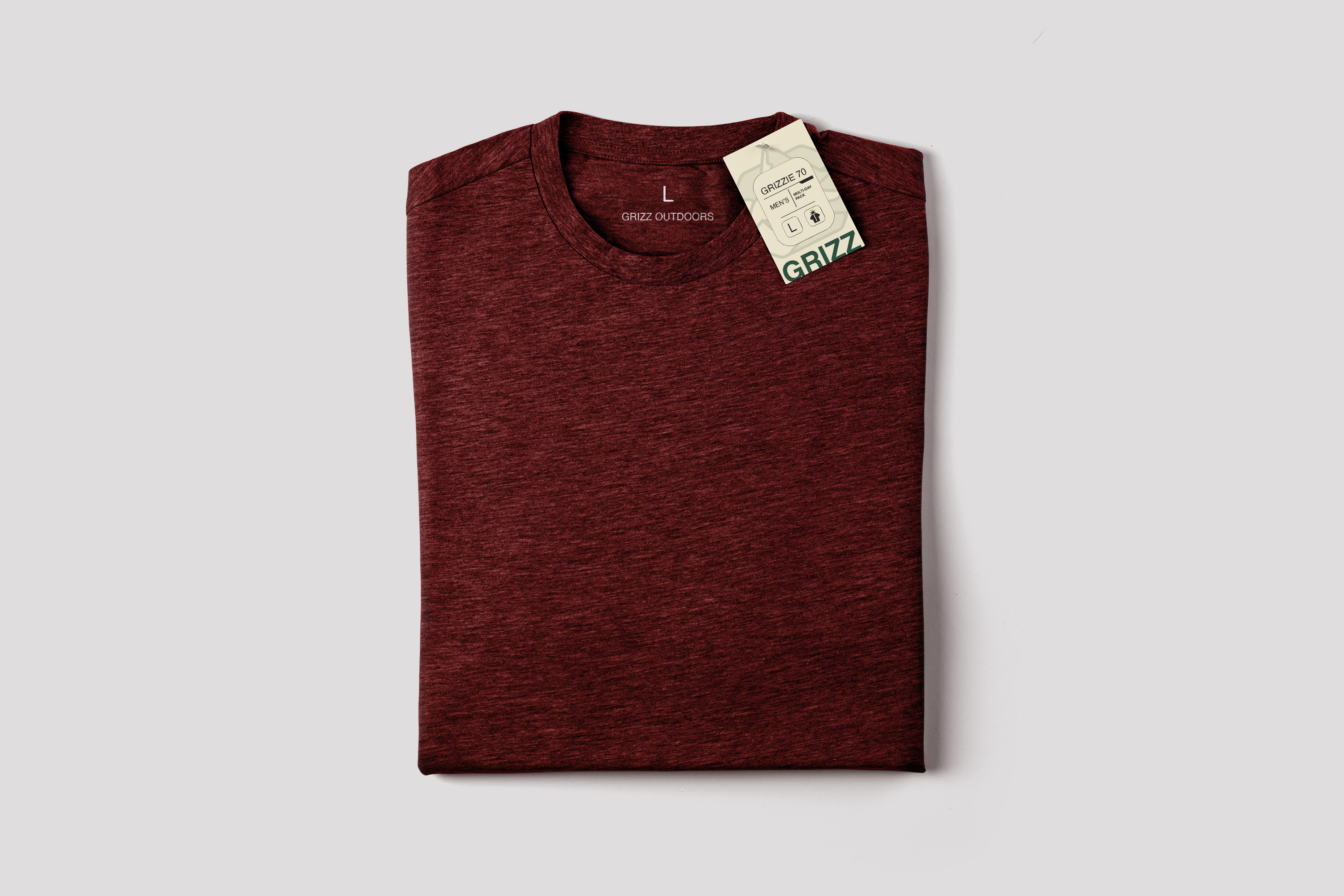
Apparel Applications

GRIZZ hoodie apparel mockup
Hoodie Mockup
GRIZZ t-shirt apparel application
T-Shirt Graphic
GRIZZ t-shirt brand mockup
Apparel Mockup
GRIZZ apparel testing surface
Testing Surface
GRIZZ outdoor bag application
Carry Gear
GRIZZ hoodie apparel mockup detail
Layered Apparel
GRIZZ apparel mockup detail
Garment Detail
GRIZZ t-shirt graphic detail
Graphic Placement

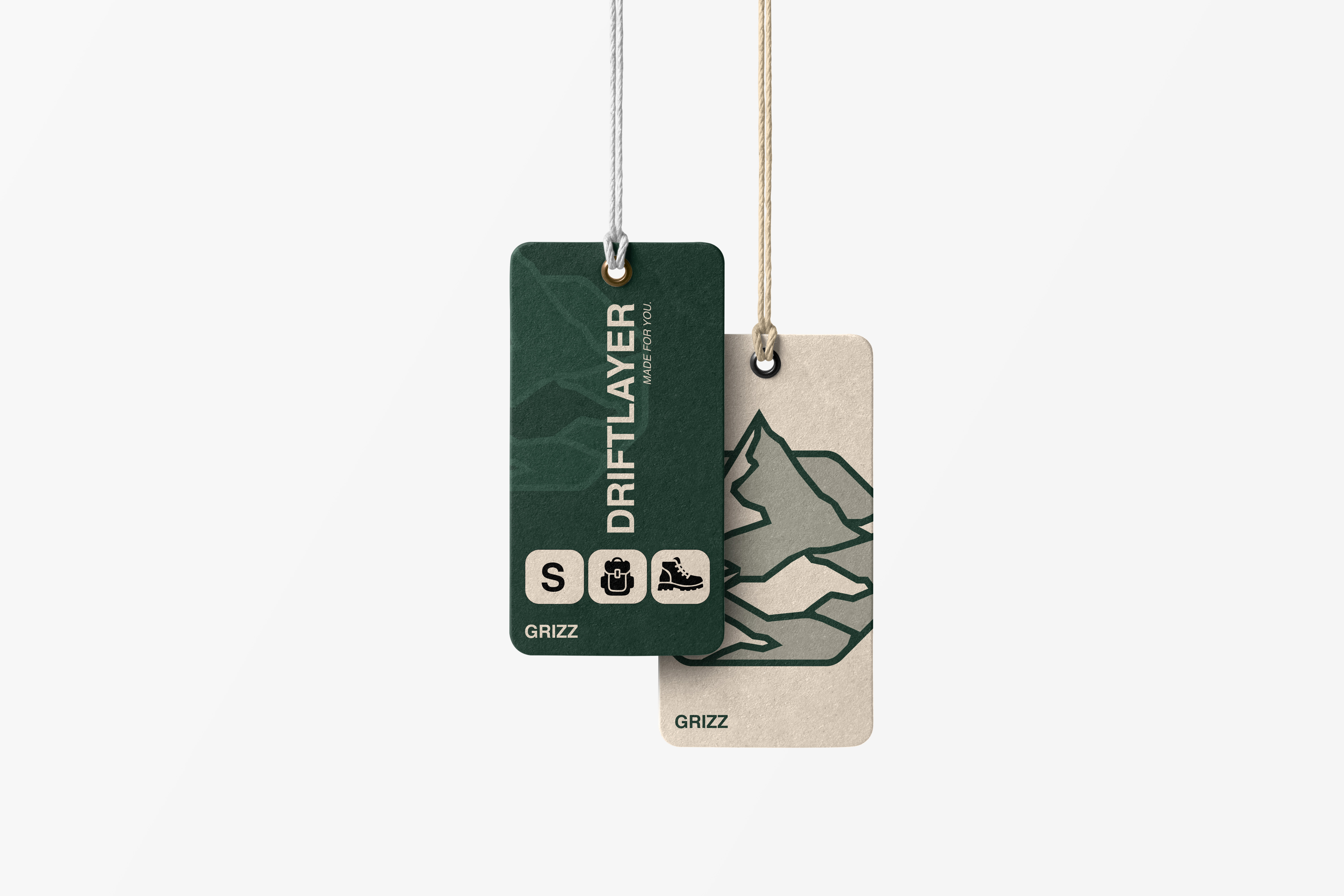
Tags + Packaging Touchpoints

GRIZZ hang tag front view
Hang Tag
GRIZZ multi-tag packaging set
Tag Set
GRIZZ tag typography detail
Type Detail
GRIZZ tag system close-up
Packaging System
GRIZZ hang tag branding detail
Brand Mark
GRIZZ multi-tag brand layout
Retail Touchpoint

Campaign + Brand System

GRIZZ campaign poster visual
Campaign Poster
GRIZZ hero background visual
Hero Surface
GRIZZ color palette system
Palette System
GRIZZ campaign composition
Campaign Visual
GRIZZ logo scaling system
Logo Scaling
GRIZZ wordmark lockup spacing
Wordmark Lockup
GRIZZ secondary logo placement
Secondary Usage
GRIZZ campaign poster detail
Campaign Poster

04 — Results

Brand recall in concept validation +33%
Pre-launch social save rate +28%
Landing page click-through estimate +21%
Audience 24-39 urban explorers
Testing Hikers + lifestyle buyers
Palette 5 core colors
"The identity made the brand feel trustworthy, premium, and distinctive without borrowing someone else's mountain language."
Previous project

Previous Project

GoPro Product
Demo

Next project

Next Project

Ontario Parks
Explorer